2026-04-22 · 4 min read
Why QR codes still matter in 2026.
They became uncool, then essential, then uncool again. Then 2020 happened. Here's why we put real effort into ours.
There's a recurring critique of QR codes that goes like this: "It's just a URL wrapped in a barcode. We have URLs. Why?" The critique is correct and beside the point.
QR is about the substrate, not the protocol
Every link-shortener competitor still treats QR as a feature checkbox, a 200×200 black-and-white square dumped into a card next to the analytics tab. We treat it as an output medium in its own right. Posters. Menus. Stickers. The back of a business card. A wall in a coffee shop.
When a QR ends up on physical material, it's there for years, and it picks up scratches and coffee rings. Two things matter: error correction (so a chunk torn off doesn't kill the scan) and contrast (so it survives bad lighting). That's why our designer gates the logo-embedding step behind a forced ECC bump, and warns you in red if you try to outsmart it.
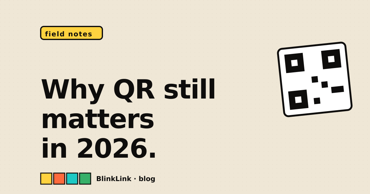
Designed for scanability first, prettiness second. The constraints make the design language.
The aesthetic case
A QR code is a small physical thing on a poster, and a poster is design. So the QR ought to be designed. That's why we offer dot shapes (square, dots, rounded, classy), gradients, palette presets that match the rest of the brand, and a logo slot that's smart about background dots. The end of the road is a QR you'd happily sticker on the back of a laptop, which is roughly the same bar as "would a graphic designer hate this on sight."
TL;DR
QR codes are infrastructure for the physical world. Treat them like it.