2026-05-19 · 4 min read
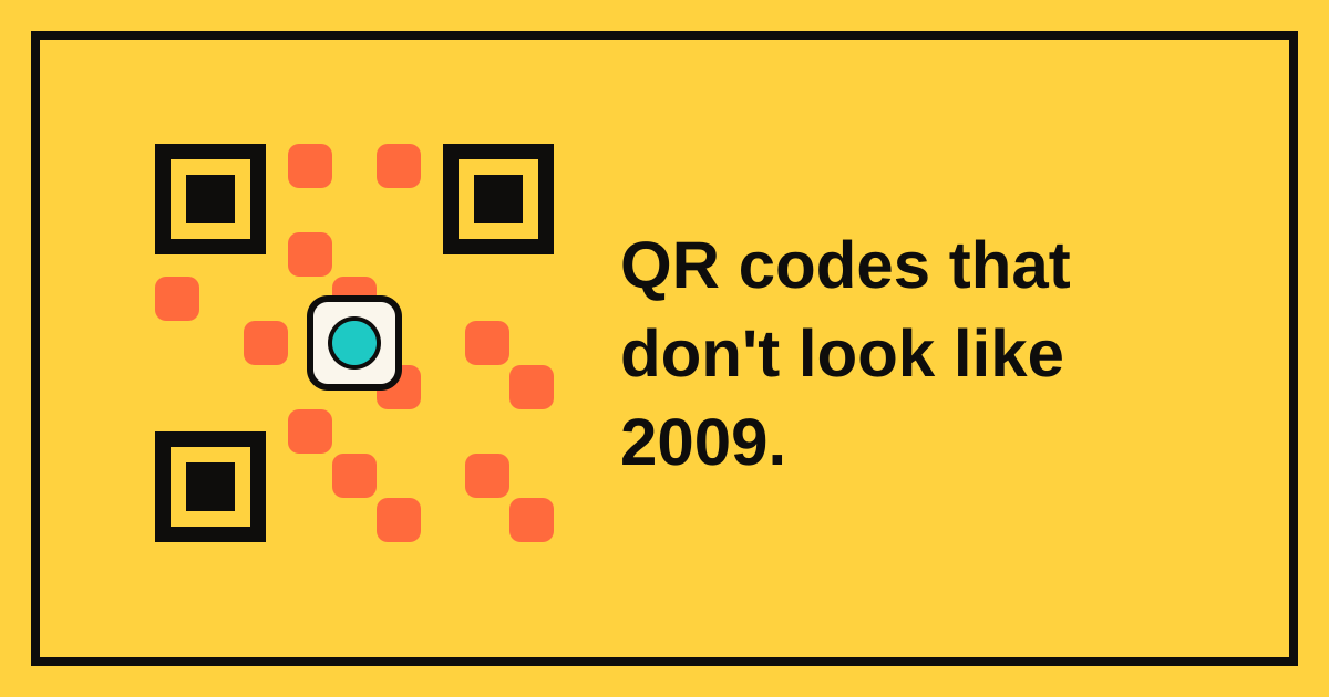
Designing a QR that doesn't look like 2009.
Colour, dot shape, logo embedding, error correction. Five practical rules from a year of obsessing over our QR designer.
The default QR (black squares on a white background, no logo, no rounded corners) is fine. It scans on the first try, on every phone, in any lighting. The reason most QR codes look ugly is that designers ignore them. Treat the QR as part of the layout and it gets out of the way.
Rule 1: contrast first, prettiness second
A scanner needs to tell foreground from background. Two colours of similar luminance scan slowly and fail on bad lighting. The designer warns you if the contrast ratio drops below a safe threshold. The vibe to aim for: a dark colour on a light background, or vice versa. Never grey-on-grey.
Rule 2: bump ECC when adding a logo
QR codes encode each character multiple times; that's what "error correction" is. Level L tolerates 7% damage, Q is 25%, H is 30%. When you cut a hole in the middle of the code for a logo, you've physically damaged it; the surrounding cells need to be ECC-Q or higher to reconstruct what's missing.
Our designer auto-bumps ECC the moment you enable a logo. You can override it down, but the field turns red, which is us asking nicely not to.
Rule 3: dot shape is design, not decoration
Square dots are universally compatible. Rounded dots look softer but lose a tiny amount of scan reliability on cheap thermal printers. "Classy" (dot with rounded corners) is a great middle ground. "Dots" (full circles, no fill) look cool on a colour-saturated background but can fail on cameras with poor low-light contrast.
If the QR is destined for a poster or business card: square or classy. If it's living on a website at 600+ px square: any of the above.
Rule 4: use the brand colour you already have
The most striking QRs use the brand's primary colour for the dots and white (or near-white) for the background. The designer ships with five palette presets (cyan, vermilion, leaf, lilac, sunny) that match the rest of BlinkLink's marketing surface. Pick one of those and you'll get a QR that looks intentional next to the rest of your site.
Use a gradient (linear, two colours) only if you've tested the scan in low light. Gradients add visual interest but eat into contrast.
Rule 5: print at 2× the size you think
QR codes are forgiving up to a point: about 1 cm × 1 cm at arm's length, 5 cm × 5 cm at across-the-room distance. The most common mistake is sizing them for the layout instead of the scan distance. If unsure, double the size you first thought of.
Test your QR before you ship
Every QR in our designer has a preview that updates as you edit, and a download-and-scan-it-yourself button. The QR isn't done until you've tested it on the device you expect your visitors to use, usually iPhone Camera, sometimes Google Lens, occasionally a barcode scanner app for events.